Sunday, December 31, 2017

Flying Into A New Year


I'm looking forward to a lot of things in 2018 and I hope you are too. This last year was very hard for a lot of us artists, who tend to support openness, expression, equality, protection of the underserved, protection of our public lands, scientific progress, and just progress in general. Sometimes our culture regresses a bit and that is depressing. But I think the direction our country has been taking has woken up the fight in so many people who at heart are pacifists. And us sweet, kind people need to fight for what we believe in too! I have a feeling that while slow to wake, our movement of caring and joining together instead of crushing and separating will be the overwhelming winner in the end. We are the giant, slow rolling, unstoppable wave of the future. So let's all take every opportunity in 2018 to shine and let our light guide the way into the future.

Happy New Year!


Friday, December 8, 2017

Dancing with the Waves


I've finished another print in this new white and black series! This is Dancing with the Waves. I really loved carving and printing both this one and the stars. Next I'm going to make birds flying!!! (My favorite.) I'm not adding these to my website yet until there are enough to make their own page, because they don't really fit into any of the categories on my site. I think they will look really good all together.
Below I'll include a few process photos.


The image is drawn on the block and ready to carve.


Details, details, details!


This is the block ready to print and photographed in some high contrast light. I had fun carving the background too. :)

Sunday, November 26, 2017

The World


Here is the progress on the latest spread for Our Home. I've made lots of images of the Earth, partly because I've been making versions of this book for a long time. You can see a bunch of them in this post. And here's the latest!


There is a neat video of me inking this block on Instagram. I can't share videos here, but I've been doing a lot over there. If you are on Instagram, say hello!


It's printed but not painted yet. I'm planning to paint it tomorrow. You can go over to my other blog, Our Home to see how it turns out and looks with color!

Thursday, November 2, 2017

Bookmaking at Mountain Village Montessori


My daughter goes to preschool at Mountain Village Montessori Charter School in Steamboat Springs, Colorado and I've gotten to do some fun projects with the preschool and kindergarteners there. This year, they added Enrichment Programs that happen once a week for the 1st through 6th graders. I volunteered to teach bookmaking and it was such a great adventure! I had 2 classes once a week for 45 minutes each, and the session was 9 weeks long. One class had the younger children and the other class had the older children.


Over the 9 weeks, we made 4 different styles of books. In the photo above, they are holding up the first books which had hard mat board covers bound to the pages with screw posts.


Then we did a sewn book with colored paper covers. Above was a beautiful moment when a whole table of boys were concentrating on their books.


Before doing artwork in these books, I explained about using a storyboard to plan the pages and then transfer your ideas into the finished book. Only a few students really took advantage of their storyboards, including the awesome job going on in the photo above. This young lady created a non-fiction book about asteroids and used her storyboard to get her book done just the way she planned it!


These two amazing comic artists above were less interested in bookbinding, but complete naturals at filling up their books with dense storytelling, comics, and Minecraft narratives.


Next we created accordion books and used fun papers to make collaged covers.


Each book turned out so differently! I loved to see when someone got really involved with their book and spent time making it just right.


 Our last one was a watercolor book bound with ribbon. So much fun!


These girls really enjoyed the watercolor and definitely could have used one more day to put the finishing touches on their books. Hopefully anything not quite done can be finished at home!


Group photo of some fantastic bookmakers! I'm so glad I got to teach these classes. I think there are definitely some students in these photos that will be making art, writing, storytelling, and even making books as an important part of their lives. Yay for books!

Sunday, October 29, 2017

Shine Bright and Fast


I'm a list maker, that's how I manage to keep everything straight. But sometimes I rebel and go completely off script, which is what happened last week. I got the unofficial word that I get to be part of a show with two other fantastic artists in a bit over a year. I abandoned all the art projects that need to get done and instead started something new that is in the spirit of the show that we will be having. I'll share more about that another time, but for now I wanted to show how this experiment turned out.


I had a stack of 8 blocks cut the same size that were left over from trimming the lino blocks for my picture book spreads. So I was thinking of using them somehow and decided to do a series of diptychs. I want to create a bunch of watery images and other things that flow and swoop and travel, so I started with stars- or maybe a shooting star or comet? I didn't think too much about it, just drew directly on the blocks which was really refreshing after doing so many detailed, thoroughly planned images.


During the process of carving the blocks I started to realize that having a break in the middle of the image wasn't really going to look good or make sense. I hadn't designed an image that used the break and made it necessary. I had drawn something that didn't want to be interrupted. Oh well, so much for not planning or doing sketches first! I tried printing it with the break and without, and the uninterrupted print was definitely the way to go.


The paper I used was Somerset Black printmaking paper, it's very thick, rich, and a little textured. The white ink sits on it a little inconsistently, giving it a blotchy look. But I like the variations in the color of the lines and I think it adds to the movement and interest.


So, the only other thing to solve is the title. I normally have everything planned before I begin, but I was doing lots of experiments and being pretty loose with this print, so now I'm trying to figure out the title. I'm leaning toward Shine Bright and Fast. But there are others I've considered. If you have a favorite or can think of something different, share it in the comments!

Shine Bright and Fast
Shine Brightly in the Dark
Shine On
Light the Way
Starbright


Monday, October 9, 2017

To the Ocean


The next spread for Our Home is done!! Yay! and whew.....

There are lots of process photos on the blog I created for this book. Please check it out and sign up with your email. I'm going to be giving away the Owl letterpress postcards I create this weekend to subscribers of Our Home. See you over there!! xo


Thursday, September 28, 2017

Owl


I get to create my first letterpress print soon! I've always wanted to do both letterpress and screen printing, but somehow never have. My brother and sister-in-law Peter and Heather Bergman, are both letterpress printers and I'm going to visit to make a set of 5x7 linocuts with handset type in a couple of weeks! If you get a chance, read about The Letterpress Depot, a public printing and workshop space they are helping to set up in Englewood, Colorado.

I need to carve the image for my 2 color print on type-high blocks so they will be the same height as the hand set metal type. I haven't gotten the blocks in the mail yet, but I have the drawing done and carving the image shouldn't take long.


I took this sketchbook page from my 100 Animals project as a starting point. I love the quote, but I wanted to use my own words.


This is what I came up with. I'm going to use black and silver ink on light blue paper. I'm so excited! I'll have photos to show later and some prints to give away. Stay tuned!

Saturday, September 16, 2017

Progress


This may be the most detailed large linocut I've ever done. I was nervous about tackling it all along, so I guess it's good I'm doing it early in the process of making this book. But it's taking forever! I also spent a chunk of time on an even larger project that is still in the early stages. I'll let you know about that as it gets farther along.

Below I'll share progress photos so at least you can see I've been doing something!

 First I take the drawing on paper and redraw it onto tracing paper.

Then I lay the tracing paper upside down on the block, rub the back with something hard, and transfer the lines. But the graphite doesn't stick that well, so I redraw all the lines on the block again so they will be visible no matter how many times my arm rubs over them while I'm carving.

 The drawing on the block and ready to carve!

 A detail of the girl and dog at the creek.

A detail of the tiny playground. Can you find it on the full drawing on the block?!

If you'd like to see more about this book I'm creating, you can check out the other blog on my website called Our Home. And you can subscribe for email updates over there!

Tuesday, August 29, 2017

Conflicting Information in Children's Publishing


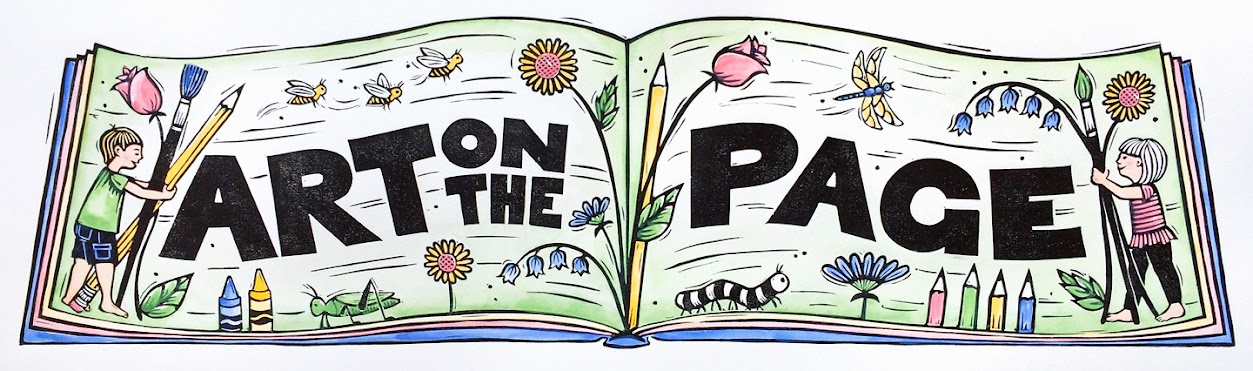
I wrote my first children's picture book text and joined the Society of Children's Book Writers and Illustrators (SCBWI) 9 years ago. I had a lot to learn! My illustration skills were not there yet, I needed to practice both illustrating and writing, and learn about how children's books work. But now, 9 years later I'm still unpublished and so I'm finally planning to self-publish my first book. I'm aware that there are things I could do better to attract an agent or editor. I'm both really good at following advice and really bad at it. But also, there are no rules! Everything you read about how to get ahead in children's publishing is advice, not clear-cut rules. We all have to make our way in this process leaning on our strengths while trying to improve our weaknesses.
Publishing has changed A LOT in the last 9 years. Things that were standard aren't so much now. Printing technology, ebooks, sharing online, and crowd funding have changed the way we can get our work seen and distributed to the people who want to see it. My own learning process through these changing technologies and traditions has led to puzzling over some seriously conflicting information. These are things that really bug me. I try to be a good girl! I try to follow wise advice, be smart, not waste my time or anyone else's.... but even if you are trying to do it right, there are a million different ways to do it right or do it wrong. The only way to get it done is to forge ahead finding your own path one step at a time.

Below are three points that really tripped me up. I spent plenty of time puzzling over them. I'd like to mention them here and then move on from worrying about them anymore. And by the way, I have my own advice for you. You can't take everyone's advice! Listen and try it out if it's coming from someone who knows you and your work AND is also in the children's publishing world- either as an author, illustrator, or publishing professional. Many well meaning people will give you quick advice without really knowing your work or background... just smile and nod. :)


Hand Lettering vs Fonts Only: 

Early on I heard that you should never hand letter any of the text. Publishers don't like it because then they can't translate it into foreign languages. Well, if you are reading this, then you are probably not sufficiently famous enough to have that problem.


But what about Melissa Sweet? She hand letters a lot and uses collaged text and is super famous (in children's publishing). Melissa Sweet is one of my heroes! There are so many great children's books by other artists that include hand lettering. Share your favorites with me in the comments so I can check them out.


And then there's Lilla Rogers who is a very well-know agent for illustrators. She teaches popular online classes that strongly encourage hand lettering. Her influence is so huge, I couldn't even figure our which image to use. But browse through her website, blog, and Make Art That Sells site to see some lovely lettering from her artists.


And then this happened- A Child of Books by Oliver Jeffers and Sam Winston. What a fantastic book! But not only does it have hand lettering, it has type used as artwork. You can read a good article about it here.

According to the article, their editor Deirdre McDermott of Walker Books, said, ‘Congratulations, boys, you’ve made the most difficult-to-reproduce and hard-to-translate book in history.’ But it HAS been translated into many languages. And not just the text and the stories making up the typographic landscapes were translated, but editors have actually picked new favorite literature in each language to make up the type landscapes.

So-- my unprofessional advice to you regarding Hand Lettering vs Fonts is... If you are comfortable hand lettering, do it!

Lots of Movement and Extreme Point of View vs Calm and Quiet:

As an artist you always hear that your illustrations need to vary points of view and have lots of depth and movement. I think books with variety from page to page are interesting. But I honestly don't like the extreme points of view, like if you were an ant looking up at a person. To me, those pages feel like tricks that the illustrator is pulling off instead of an image that is doing service to the story. 

Depth is good along with contrast because it helps guide your eye through the page. But I've decided not to feel too down on myself because I'm not very good at creating depth, I've always liked flat images! 


I remember the first time I pulled Joseph Had a Little Overcoat from the bin at the library. Yes! I loved it so much! And I checked out every book that Simms Taback illustrated. And you notice the shiny circle on the cover? Other people loved these fun, flat, colorful illustrations too. 

About movement, you can't have life without movement, so it's a good thing. But I feel extreme movement and energy are often held up as the shining example that me must all try to achieve. But those books just wear me out. They are great for some people but not everyone. I've decided those high energy, extreme point of view books are extroverts. And us introverts need calmer, introverted books. Below are some gorgeous spreads from some of my favorite illustrators. Don't they make you feel wonderful?


My unprofessional advice to you about doing Lots of Movement and Extreme Point of View vs Calm and Quiet is of course, do whatever suits you best! But especially, if you like flat, quiet, beautiful illustrations, don't feel that you are less than those people who can draw perfect perspective and lots of movement. We need introverted books too!


Write What You Know vs Don't Write About Your Kids/Grandkids/Pets

'Write what you know' is general writer advice that you hear a lot. And 'don't write about your
grandchildren or your dog' is advice you'll hear a lot from editors in children's publishing. Well, what do you know better than your family, right? I think "don't write about your grandchildren or your dog' is misleading. You can write about them if the writing and illustrating is professional and interesting. Or more likely, you can be inspired by them and turn that into a story that was influenced by them. And I'd like to add that almost any creator in children's books that has children or grandchildren or pets will admit to being inspired by them.

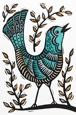
This is a linocut inspired by my daughter meeting a real life (parade float) dragon!

I don't think you need to be tied to what you know, though. Children's books are a fantastic place for imagination. And they are a wonderful way to explore new things, people, history, or situations (after doing research). There is a big movement encouraging diversity in children's books AND in children's book creators. That is very overdue. Not only do we need children of color to see themselves, but all children need to see other cultures and faces represented in their books. I agree that books about a certain culture should be created by people from that world whenever possible. But that should not keep authors, illustrators, or young readers from following their curiosity where it leads. 

Sometimes you start by writing what you know and it takes you to magical places. And sometimes you are creating an imaginary story, but at it's core is an emotion or idea that is very close to your experiences. My unprofessional advice regarding Write What You Know vs Don't Write About Your Kids/Grandkids/Pets is, toss this whole problem out the window and just write well. Write and rewrite, and get feedback, and write more. The End.

I actually have eight more line items on my list of conflicting advice from the children's publishing world, but that seems like more than enough for now. If you are holding your breath wishing I'd write more of these sarcastic lightly-veiled frustrations with following advice, let me know and I'll do more. Haha! Happy writing and arting to you all!

Thursday, August 10, 2017

New Things!

I made some changes on my website that I want to share.


If you scroll to the bottom of my shop, you can now buy different sets of cards! And when I get a chance to order more from the printer, I'll add another set with Magic is Everywhere and the cards in that style.


I also added a new page, Sketchbook. It's a combination of favorites from 100 Animals, 100 Trees and other sketchbook pages. The full 100 series are still out there, but there isn't a menu option from my website because there were just too many pages cluttering the place. I think it looks pretty good!

And the most exciting news is that I made a new blog on my website all about creating my picture book, Our Home. I'm planning to self publish so I'm taking advantage of not needing to keep anything secret and sharing the whole process. Please stop over and sign up for email updates! I will keep up the inconsistent posts here on Art on the Page, but most of the book related art and info will be over there.


I'm pretty excited to show off the most recent completed linocut for Our Home. This is the first full spread after the half title page. I'm planning to squeeze all of the publishing fine print in the top left corner.  There are lots of process photos on Instagram and I'll include lots on the new blog also!

Wednesday, July 26, 2017

Our Home

I got mostly caught up on the projects I'm doing for other people, so I'm back to working on my picture book! 


Above is my tracing paper and the art drawn onto the linoleum block. I do a clean drawing on tracing paper and then lay it upside down on the block. Then I rub the back of the tracing paper with something very hard, often the non-sharp end of an X-acto knife. That transfers the lines backwards. But the graphite sits on top of the surface lightly and is pretty easy to rub off. So I usually redraw all of the lines directly on the block with a pencil.


I decided to carve all of the text, mostly because I can! It's fun for me to be able to play around with the lettering. If I decide to, I can erase the text out of the digital files at the end and add it back in traditionally using the computer. So I'm not too worried. Another thing I can do is make a print without inking the text, then I could get a nice image for framing without text.


The top and bottom are the cover and an interior spread, and the middle is the block I'm working on now. I'll be sharing lots of progress photos on Instagram if you'd like to see!