Wednesday, February 26, 2014

Cuckoo Clock Phone Cases


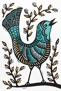
Here is my final Cuckoo Clock print. The red and gray was a last minute thought I had. I'd painted it with greens and pinks, and another one with blues and yellows. They looked cheery, but not very memorable. Then about 6 hours before the final image was due for Lilla Roger's Assignment Bootcamp, I had the idea of using a stamp to print spirals on the background and paint the image red and gray. I think it turned out so much better! Soon I'll have a print in my Etsy shop also.


Most people submitting their cell phone mock-ups were making nice layouts including coordinating patterns, color swatches, and logos. Here's the layout that I went with- it has an image of the carved block. I would have liked to make some patterns also, but I  ran out of time.

If you want to see more than 400 (!!!) cuckoo clock cell phone covers, check out the gallery here. Mine is on page 8. There is lots of gorgeous work in the gallery!

Sunday, February 23, 2014

The Bad Art Phase

In my last post I mentioned about our cuckoo clock assignment in Lilla Roger's class. I was excited to try some new techniques to see if I could find a way of working that I liked and was quicker than my usual detailed linocuts. I'm happy to say that I did try out some new ideas, but oh boy, did I make some bad art!


I liked the large cuckoo clock drawing that I did, so I carved some stamps for it and also painted some areas with watercolor. At first I thought it was going to look really neat. But it didn't.


I tried a little collage with stamps. Then I tried printing the stamps alone and with watercolor. I have a really bad  stamp-with-watercolor that somehow didn't make it into this photo. Finally I realized that if I was going to have anything to submit by the deadline I'd better go back to what I know and do a linocut. So I simplified my clock drawing and carved the block below. You can see a couple of my color trials above that were ok but not great.


So, very last minute, I repainted the print one more time, got a presentation layout I liked and submitted my cuckoo clock cell phone case. Whew! I'll show you my finished version soon!


Tuesday, February 11, 2014

Cuckoo Clocks


We are a little over a week into Lilla Roger's Assignment Bootcamp. It's been really fun! Last Monday, we got an assignment to sketch cuckoo clocks. We could play around with different themes and elements for the clocks. At first I wasn't really excited. Traditional cuckoo clocks are ornate, carved, wooden, and with woodsy themes, animals, and people. That style isn't my favorite. But the artwork people were posting was so varied, interesting, and fantastic! So I warmed up to the idea and as I started drawing, I zeroed in on some themes that I liked that weren't traditional.

My clock has a day and night theme. I'm imagining the word cuckoo and the numbers on the clock face are neon tubes. And the stars and decorative circles are lit also. The music is the opening of You Are My Sunshine. In the earlier sketch, I also had Twinkle Twinkle Little Star but it was a little too crowded. I'm going to make stamps to color the birds, flowers, and some other decorative bits, and watercolor the rest. I haven't tried combining stamps and watercolor like that, so I hope it looks good.

Yesterday we got our main assignment for February which was to turn our clocks, or elements of the drawing into cell phone cases. Again, I wasn't super excited. I recently made a case from my artwork and it's ok- I like the art, but I don't like the case itself that much. So I'm going to see if I can find a case I like better. And in the meantime, people in the group have started posting their finished cases and  they are so neat that it's making me excited to do it myself. What fun!

Thursday, February 6, 2014

Aarrrooooooo

I ordered a few sheets of 5x7 Richeson Clear Carve Linoleum because I saw an ad for it and it was interesting on a few different levels. First, it is clear so I figured that was one less step in transferring a drawing. Second, it is clear, how weird! And third, there is a contest. If you use their linoleum, you can enter your piece and win an etching press. So, I took a bunch of photos along the way and I thought I'd do a little review.


Here it is laid over my drawing. You can't use pencil to draw on the surface, but a ball-point pen worked ok. 


I started carving and it is so plasticy feeling. I mean, it IS a sheet of plastic, but it also doesn't feel very good to handle, like carving a wad of saran wrap. I also had a very hard time knowing what I was doing. I couldn't tell the depth of the cuts, or exactly where I was making them. There are strange shadows once you start carving. I struggled for a while, and decided to change the border so that I'd have less carving to do. I imagine there is some way to remove the drawing from the plastic, but I didn't experiment. I just started drawing over everything with a sharpie. It turned into a big mess.


Here it is all carved.


And, in the meantime I stamped a couple sheets of printmaking paper with the stamps I made a couple weeks ago.


Then I printed over the top with dark brown ink. The block actually made a really nice print. All of the ink wanted to transfer to the paper easily. And when I went to clean up, I just wiped the block with a rag and practically all of the ink came away. That was really nice.


Then I painted the dog with watercolor and it's finished! Printing over patterned paper is something I've been wanting to do, but I really didn't know if it would work. I think it turned out well! This print needs the watercolor, but in the future, I will make the ink lines heavier and maybe the print won't need to be painted. 


Saturday, February 1, 2014

Mark Hearld

I wanted to share two beautiful books of artwork by one of my favorite artists, Mark Hearld.


Outside Your Window is a book of poems and writing for children by Nicola Davies and illustrated by Mark Hearld. It's a big hefty book of over 100 pages compared to most 32 page children's books. And the artwork is gorgeous! I originally fell in love with Mark's linocuts. But he mostly does collage and some lithographs. Below are some of my favorite collages from that book.


And the two spreads below are linocuts from Mark Hearld's Workbook. Aren't they heavenly? The Workbook is also a large book of artwork, images of Mark's eclectic collections, and writing about his process and inspirations. 


Mark's winter scenes really capture the shivery essence of snow! The book doesn't say, but I think these images are mixed-media that include monoprinting.