I sooooo love beautiful layered textures and mixed media. Some of my favorite artists work this way- check out the amazing Pamela Zagarenski for example! I've been trying for years to find my own way of combining printmaking with other media and lots layered color. It's been a challenge but I think I've worked out ways to balance watercolor, ink, stamps, collage, and drawing. Just in case you think it was easy, let me show some of the steps I went through to get the final 5 images. Each progress photo shows the original sketchbook idea (or two!) and then some not-successful attempts.

It helped this one a lot when I went back to the warm yellow background, more like the original sketchbook painting.

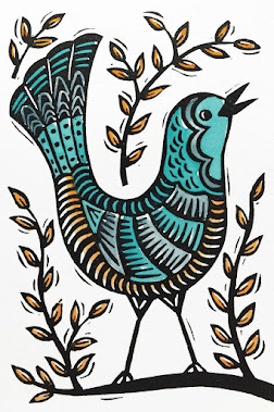
Above is the final sweet blue bird, happy in her nest.

I was anxious to get this one right because it's a special image for my daughter. It wasn't working for me with the traditional colors but I went crazy and tried a dark purple/blue/maroon background with white ink, kind of like my original sketchbook painting and that was the winner!


Part of my struggle with this one was that the paper I was using didn't take water very well. If I used too much watercolor or gouache the paper got too wrinkly. But a layer of ink with a little water media on top is a neat effect and the paper stayed pretty flat. I actually used a cut-out and glued tree and heart for the final one instead of trying to paint white around where I wanted them to be like in the image above.


This one I did so many times I was starting to hate it. But I'm glad I stayed with it. And you notice, my daughter also got to do her own interpretation of a starry tree.

I love stars and star stamps. Obviously!

I tried collaging the trees on this one like I did for The Love Tree, but they didn't look good with the dogs and moon stamps. So I cut the trees out of thin cardboard and printed them. It gave them a look that matched with the carved stamps better.

There they are- the first cards in my new series! I'm having them printed and I can't wait to hold them in my hands. There will be a line of text inside each also, but you have to wait to find out what the insides say!
Beauties - esp fond of the dogs on the bench!
ReplyDeleteThanks so much, Julie! :)
DeleteThese look so professionally beautiful! I agree with you about the textured/layered look. I'm also trying to get that in my work! And it's working so well for you!
ReplyDelete